Logo Design: The Evolution and Science of Visual Identity
A logo (short for logotype) is a graphic mark, emblem, or symbol used to aid and promote public identification and recognition. Derived from the Ancient Greek words lógos (word/speech) and túpos (mark/imprint), a logo can range from an abstract design to a figurative image, or it may include the text of the name it represents, known as a wordmark.
While modern usage often treats "logo" as synonymous with a company's brand or trademark, the term historically had a more technical meaning. In the era of hot metal typesetting, a logotype referred to a single word cast as one piece of type, distinct from a ligature, which joined only two or more letters.
Key Facts
- First Trademark: The Bass red triangle became the first trademarked logo in 1876.
- Core Classifications: Logos are generally categorized as ideographs (abstract), pictographs (representational), or logotypes (text-based).
- Modernist Influence: The "Less is more" philosophy of the 1950s shifted design toward conceptual clarity and simplicity.
- Global Utility: Ideograms are often more effective than text in global markets because they transcend language barriers.
- Digital Adaptation: Modern logos favor bold lines and solid colors to remain legible across various screen sizes.
The History of Visual Identification
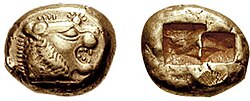
The journey toward the contemporary logo began thousands of years ago. Early methods of identification included cylinder seals around 2300 BCE and the minting of coins around 600 BCE. These were followed by the development of coats of arms, watermarks, and silver hallmarks.
The Industrial Revolution in the 18th and 19th centuries accelerated this evolution. As societies shifted from agrarian to industrial, the rise of photography and lithography fueled an advertising boom. Typography expanded from modest book serifs to bold, ornamental styles used on broadsheet posters. By 1890, the United States alone had 700 lithographic printing firms.

During the 1840s through the 1870s, innovators like Rouchon, Joseph Morse, Frederick Walker, and Jules Chéret moved away from representational art toward figurative imagery using bright, flat colors. Later, the Arts and Crafts Movement of the late 19th century reacted against Victorian excesses, emphasizing craftsmanship and quality, which encouraged companies to create unique, credited marks.
By the 1950s, Modernism transformed from an avant-garde European art movement into a global commercial tool. This era emphasized visual simplicity, a trend that proved highly successful with the advent of television and digital innovation.
Contemporary Logo Classifications
Modern logos typically fall into three categories, though they are often combined into a "logo lock-up"—a fixed arrangement where elements cannot be resized or moved individually.
- Ideographs: Completely abstract forms (e.g., Chase Bank).
- Pictographs: Iconic, representational designs.
- Logotypes (Wordmarks): Designs depicting the company name or initials.
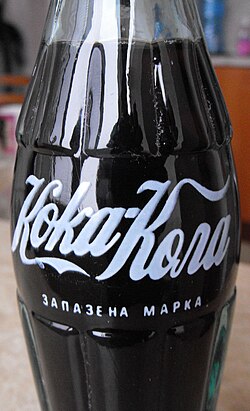
In a globalized economy, symbols often outperform text. For example, the Red Cross and Red Crescent emblems are recognized worldwide without needing a written name. Similarly, Coca-Cola maintains brand recognition across different alphabets, such as Cyrillic, by utilizing a consistent color palette and its signature "ribbon wave" design based on Spencerian Script.
The Science of Logo Design
The Role of Color
Color is a vital tool for brand differentiation and can psychologically influence emotions and reactions. Because human visual perception relies heavily on contrast for detail detection, color choice is critical. Designers often use color mapping to systematically evaluate existing colors within an industry to ensure a new brand stands out.

The Design Process
Creating an effective logo is a collaborative effort between marketing teams and graphic designers. The process generally follows these stages:
- Research and definition of brand values.
- Conceptualization.
- Investigation of alternative candidates.
- Refinement of the chosen design.
- Testing across various products.
- Final adoption and production.
Dynamic and Digital Logos
While traditional logos remain static, dynamic logos change based on the context. This trend began as early as 1898 with the Michelin Man and is used today by brands like Google and MTV. In the digital age, designers are shifting toward bolder, simpler shapes to ensure logos remain clear when scaled from large monitors down to handheld devices.

Legal Protection and Industry Use
Logos are protected through copyright and trademark laws. In the UK, the Intellectual Property Office governs these registrations. Generally, a trademark protects the visual design rather than the specific colors used. In some civil law countries, simple geometric logos may not meet the "originality" threshold for copyright but can still be protected as trademarks.
In the world of sports, logos (or crests) serve as vital symbols of history and identity. For teams like the New York Yankees or Manchester United, the logo and color scheme become synonymous with the players and the organization's legacy.

| Logo Type | Description | Example/Characteristic |
|---|---|---|
| Ideograph | Abstract geometric form | Chase Bank |
| Pictograph | Representational icon | Apple or Twitter (X) |
| Logotype | Text-based wordmark | Coca-Cola |
| Dynamic Logo | Changes based on setting | Google Doodles / MTV |
Frequently Asked Questions
What is the difference between a logo and a logotype?
While often used interchangeably today, a logotype specifically refers to a wordmark—a logo centered on text or typography. A "logo" is a broader term that includes abstract symbols (ideographs) and representational images (pictographs).
Why are simple logos better for the internet?
Because digital interfaces vary from giant monitors to tiny smartphone screens, simple logos with bold lines and solid colors scale more effectively without losing clarity or becoming cluttered.
How does color mapping work in design?
Color mapping is a methodology where designers identify and map the colors used by competitors within a specific industry. This allows them to choose a color that provides maximum differentiation and visibility.
Can a logo be protected if it only uses simple shapes?
Yes. While simple geometric shapes might not meet the high threshold for copyright protection in some countries, they can typically be protected under trademark law as a symbol of a specific brand.
What is a logo lock-up?
A logo lock-up is a final design where the symbol and the text are "locked" into a specific position and relative size. This ensures the brand identity remains consistent and is not distorted by resizing elements individually.